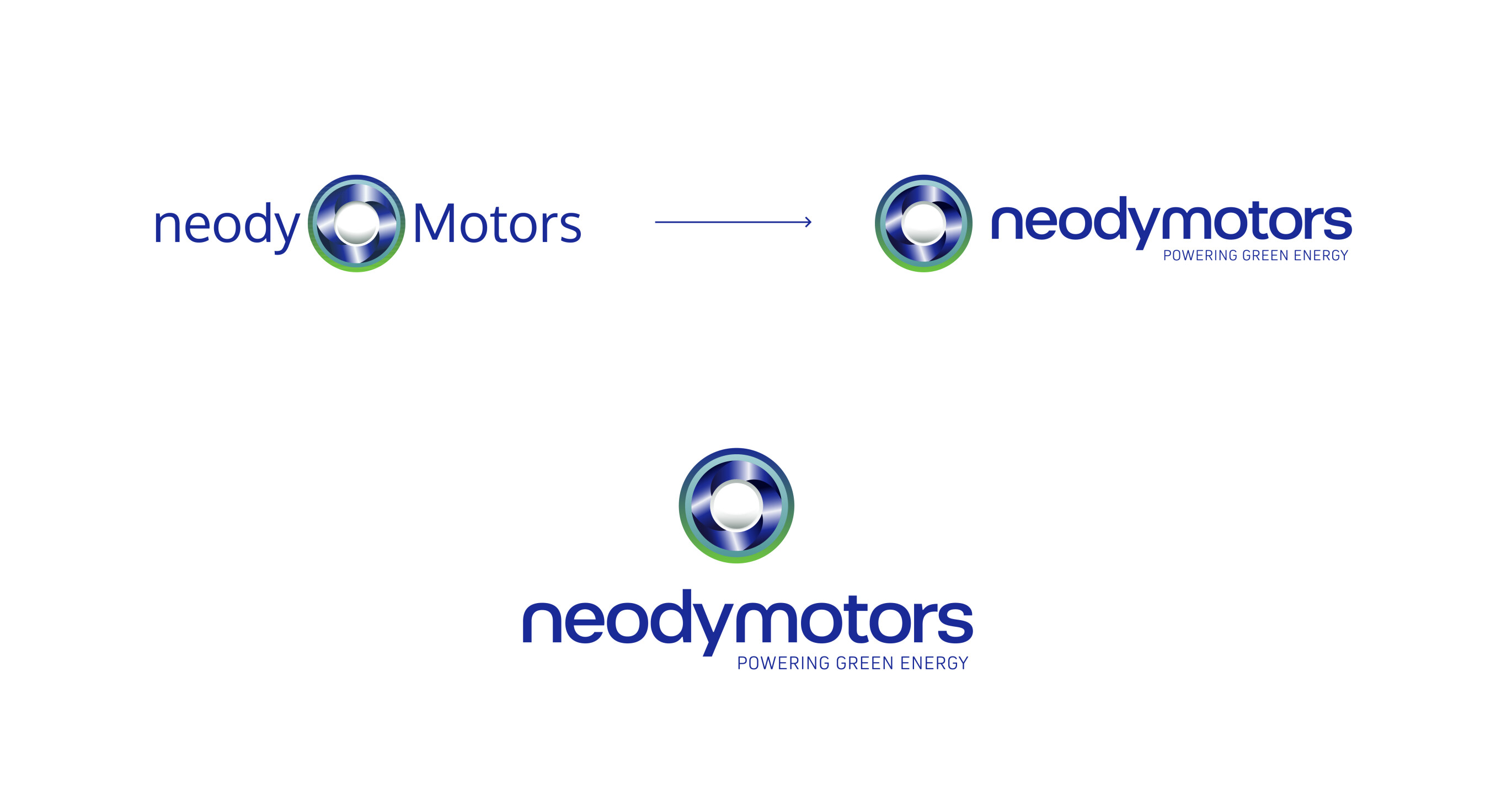
The rebranding process of neodymotors was guided by a clear principle: to preserve the essence of the original symbol, created by the founders, which accurately represents the technology developed by the brand — a circular system that generates kinetic energy as it rotates.
This visual element, rich in both conceptual and emotional value, was retained and carefully refined. The focus was on the technical fine-tuning of the symbol: we adjusted thicknesses, proportions, and alignments based on strict grids, giving it greater harmony, balance, and visual consistency. Typography was another central aspect of the update.
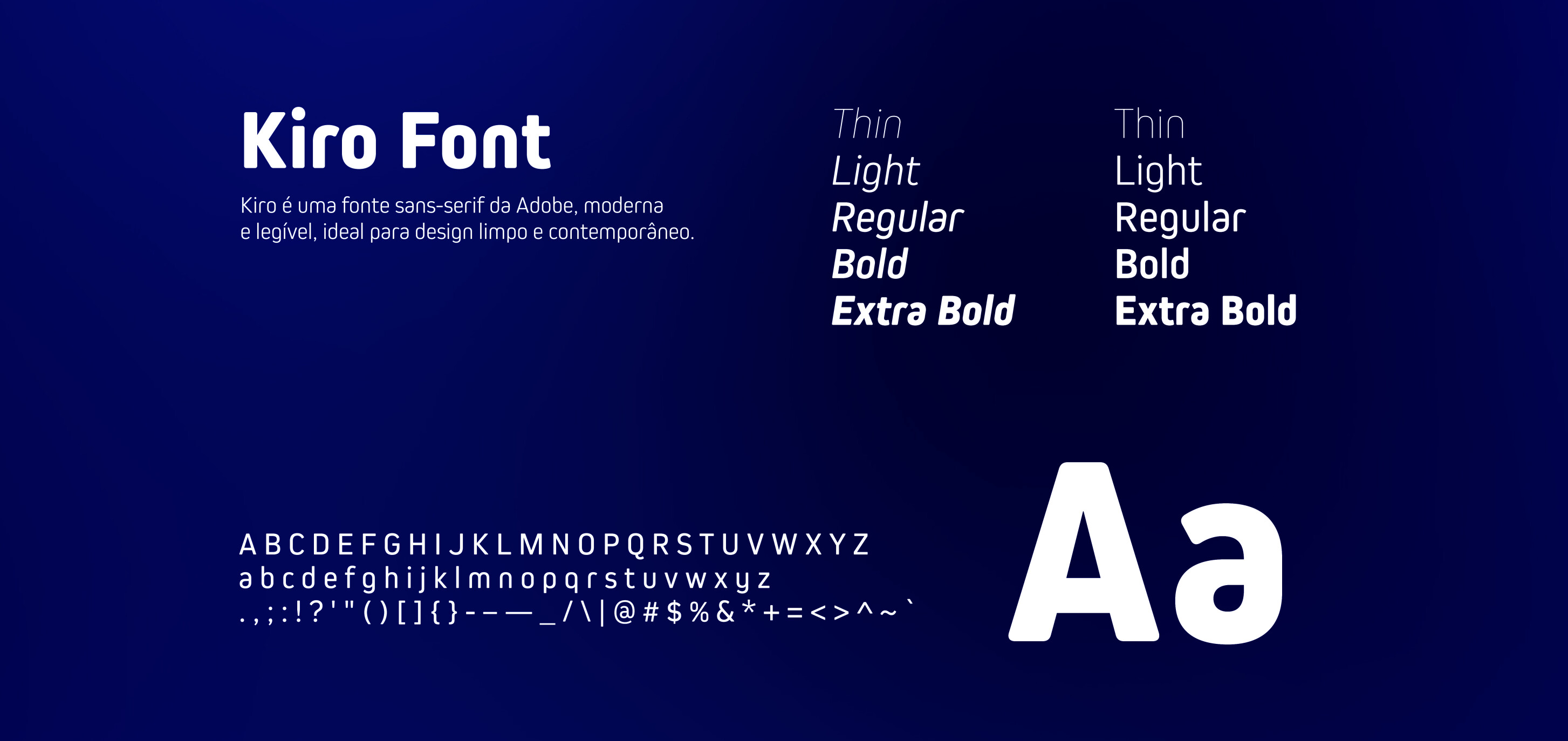
A futuristic and fluid typeface was chosen, with special emphasis on the letters N in neody and M in motors, conveying dynamism, innovation, and a connection to advanced engineering.
