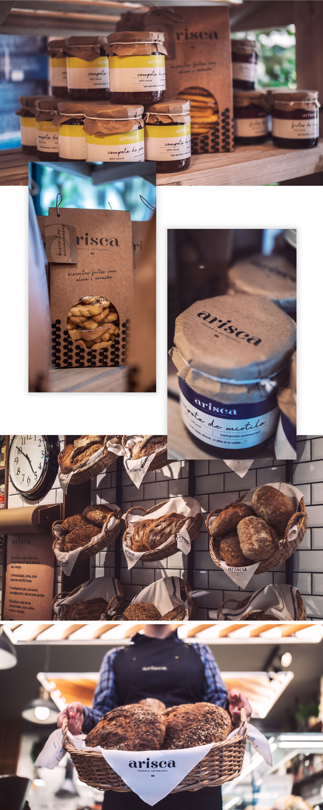
Bread made with time, with hands, with soul and with heart. The logotype created for the brand consists of a typographic exploration whose serifs offer a distinctive personality to the word “arisca”. It was intended to represent the fluidity that the dough acquires as it is being slowly worked on. It is that fluidity that characterizes and makes the flavor of Arisca’s bread unique.
We also highlighted the irreverence and rebellion printed in the letter “i”, that reveal by reversing the shape of an apostrophe at is top. The apostrophe is a sign of punctuation that indicates the suppression of letters or words and its inverted placement in this proposal symbolizes the opposite: at Arisca nothing is hidden or unsaid.


Starting from the shape of the apostrophes, we created several different patterns - one of them represents the shape of an ear. Thus, the elasticity of this symbol makes it the a key part of the brand’s visual identity, allowing to be applied to different products.


