CC Capital is a Portuguese private investments company, operating in areas such as industry, real estate, catering and financial investments in the global market.
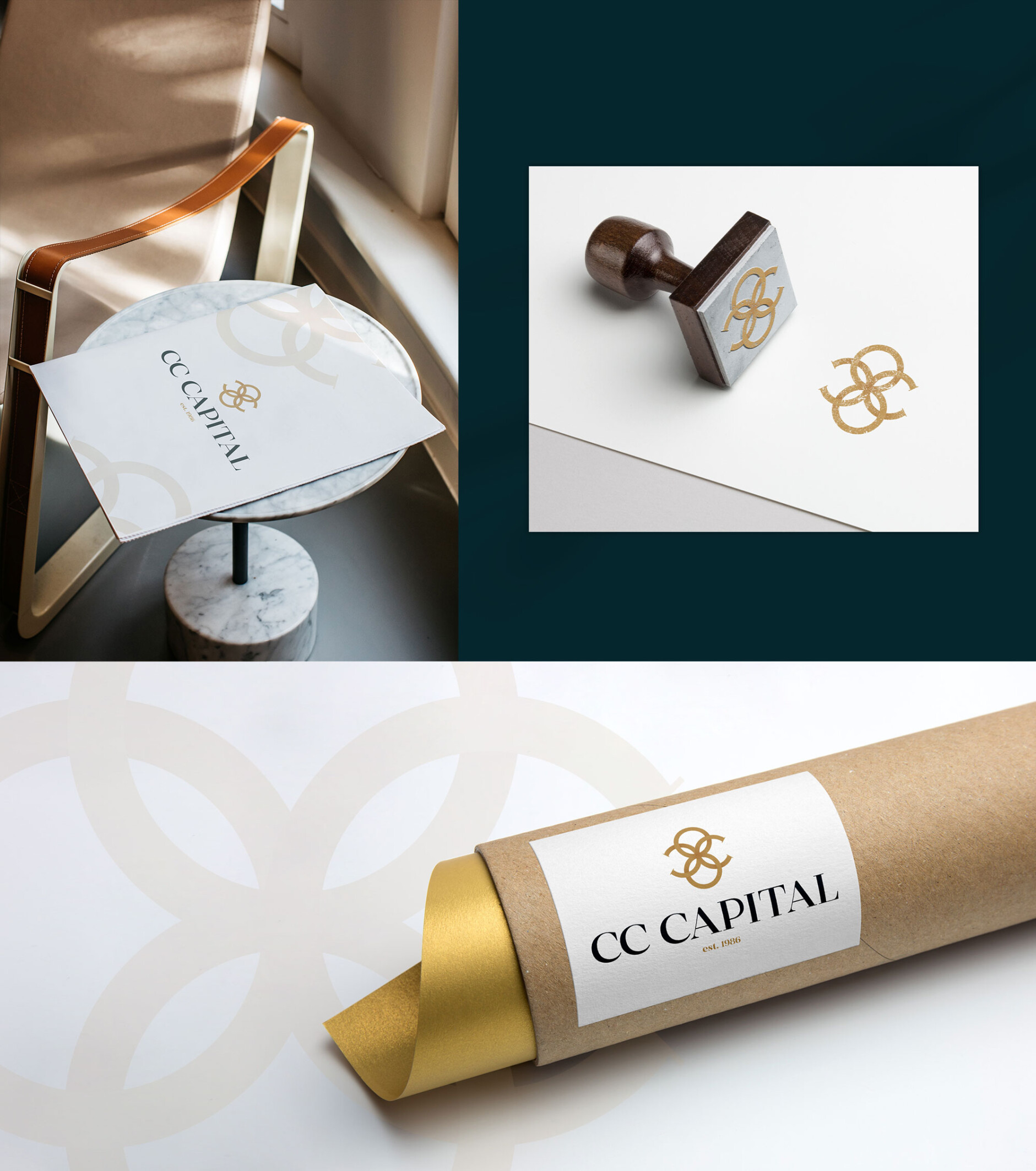
Focused on the knowledge and experience acquired by the group over its more than 120 years of existence, we created a monogram, whose symbol refers to nobility and tradition.

Despite its contemporary and minimalist lines, the visual identity still transmits family and traditional values.
From a circle, we extracted a quarter and obtained the letter C, initial of each word that makes up the name of the group. When we put it in symmetry, we get two C’s, representing the initials of the family’s last name – Campos Costa.

The final symbol results in the intersection point of all the elements presented, thus demonstrating the connection between the various business areas explored by CC Capital, referring us to a family crest and its achievements.
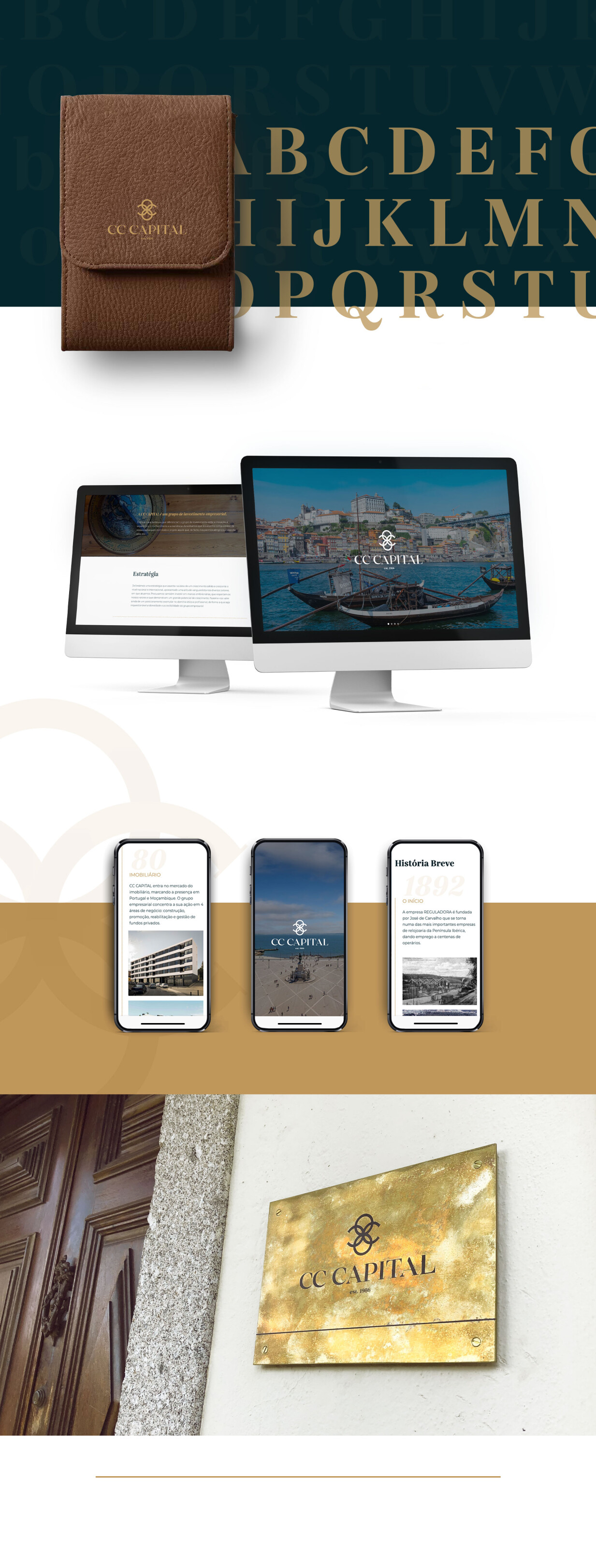
The chosen color pallet, whose main colors are dark green and beige, represent the balance, strength and maturity of a group established over 120 years ago.

