Famalicão, your place

The new identity of Famalicão is born and expands from a circle. It represents perfection, centrality and iconic elements of the city. This circle illustrates the strength of the community.
The visual identity mirrors the city in a contemporary, minimalist, intuitive and timeless way, representing Vila Nova de Famalicão independently of the context and reinforcing the recognition of the municipality in Portugal and in the world.

From the circular matrix is born the symbol: an F, minimalist, and contemporary that materializes the vision of modernity of Famalicão. The "F" was painted with the colors that mirror town's values: dynamism, tradition, innovation, and sustainability.

Your place
The slogan gives a voice to this new identity, through an expression that evokes space and people, the "body" city and the "heart" city. What turns Famalicão into a special place is the fusion between its geography and its people unique characteristics. By saying "Your place" we converge physical space with emotional destiny. Famalicão as a place for everyone.

Famalicão is made of and for people. Like a circle that is continuously renewed, Famalicão gains a new life every day and offers what it has of more valuable. It's a land of peace, of opportunity. It's a city that unites places made of tradition and modernity and where the future is shaped by everyone, every day.

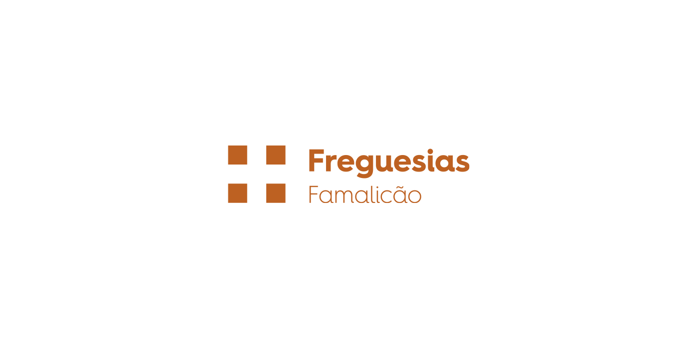
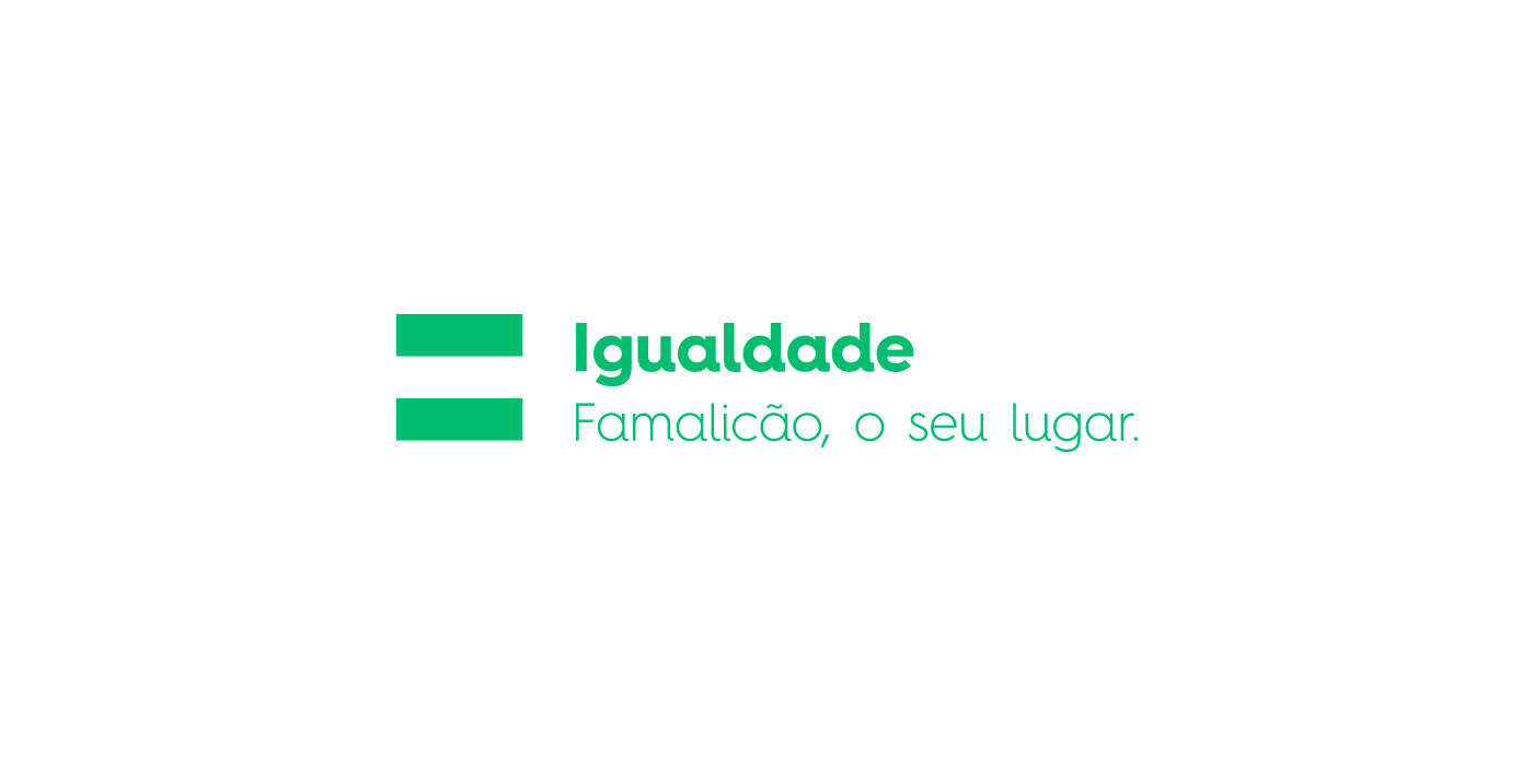
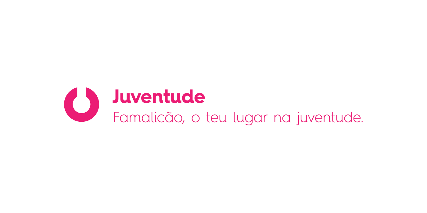
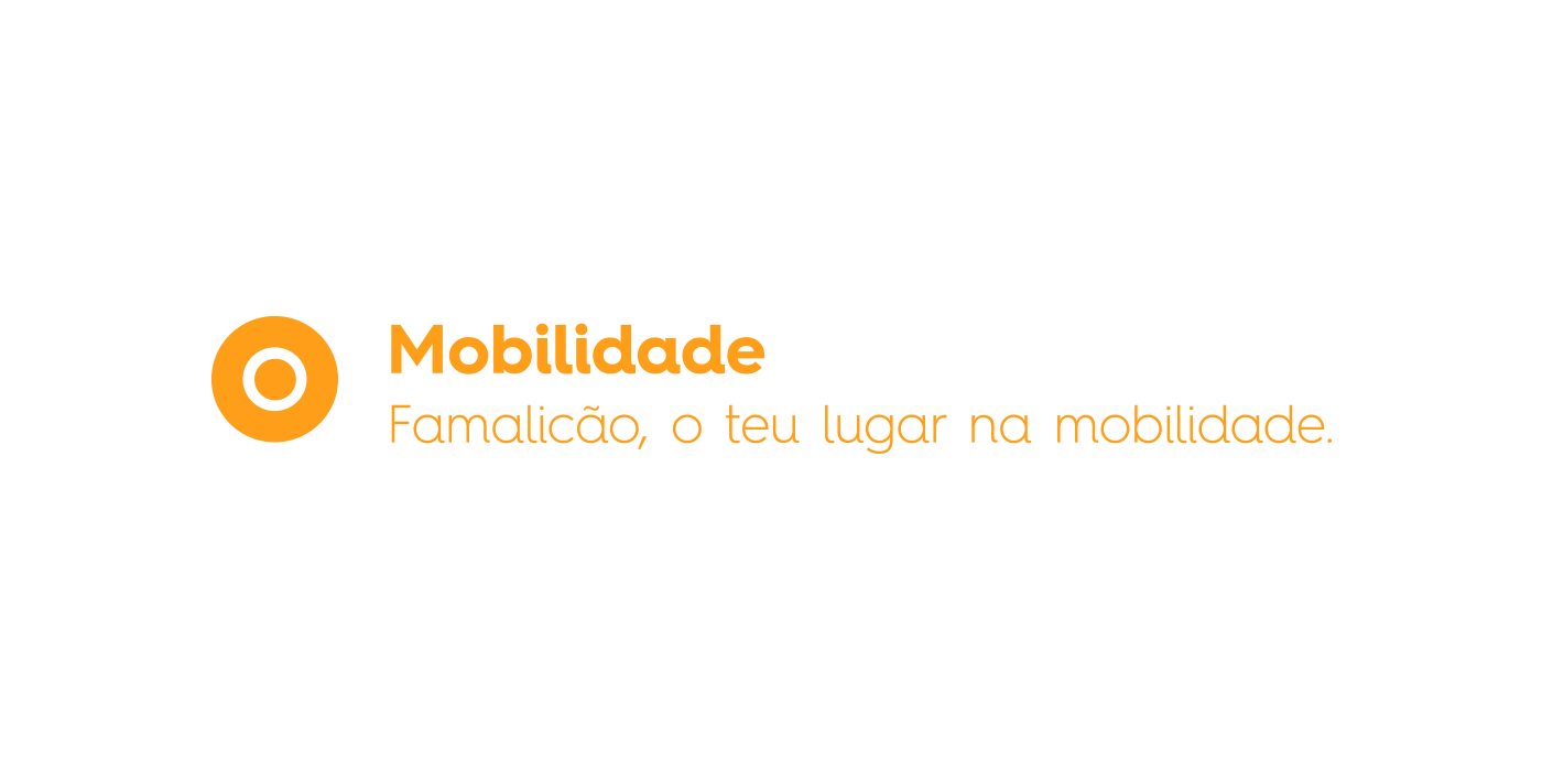
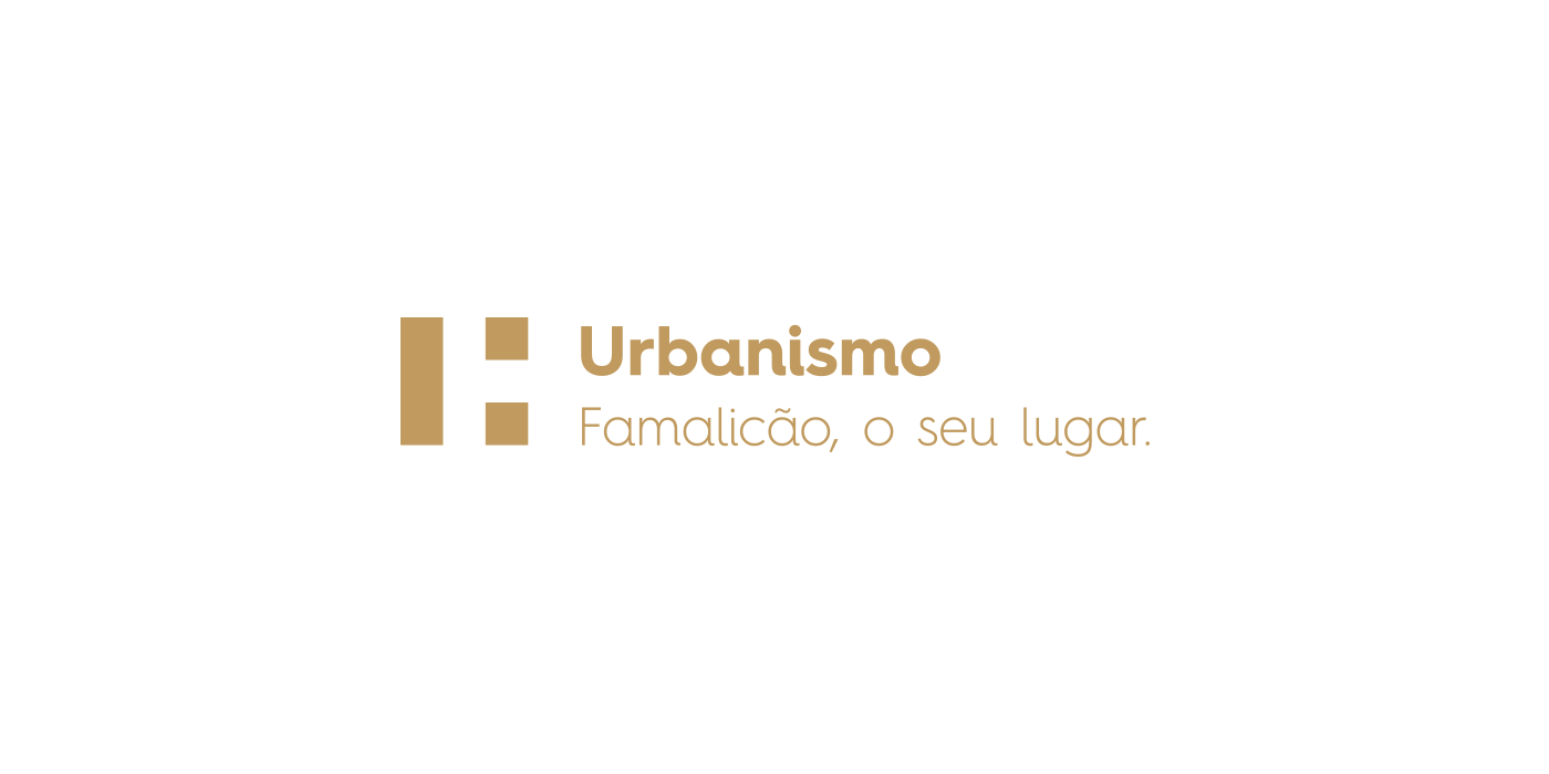
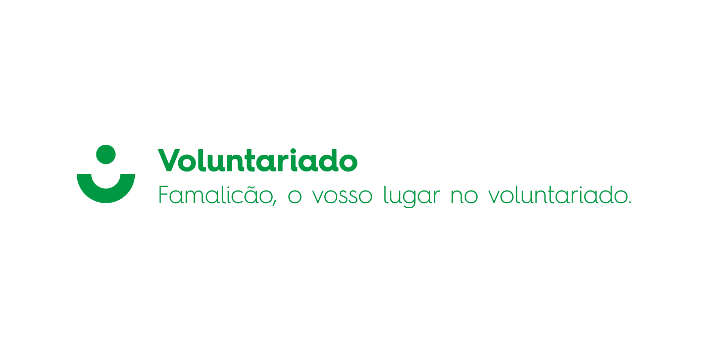
From the brand's main symbol grid, it was created unfoldings for the various City Hall's areas and departments. These visual representations of the respective area/department materialize a proper concept through its forms and colors.
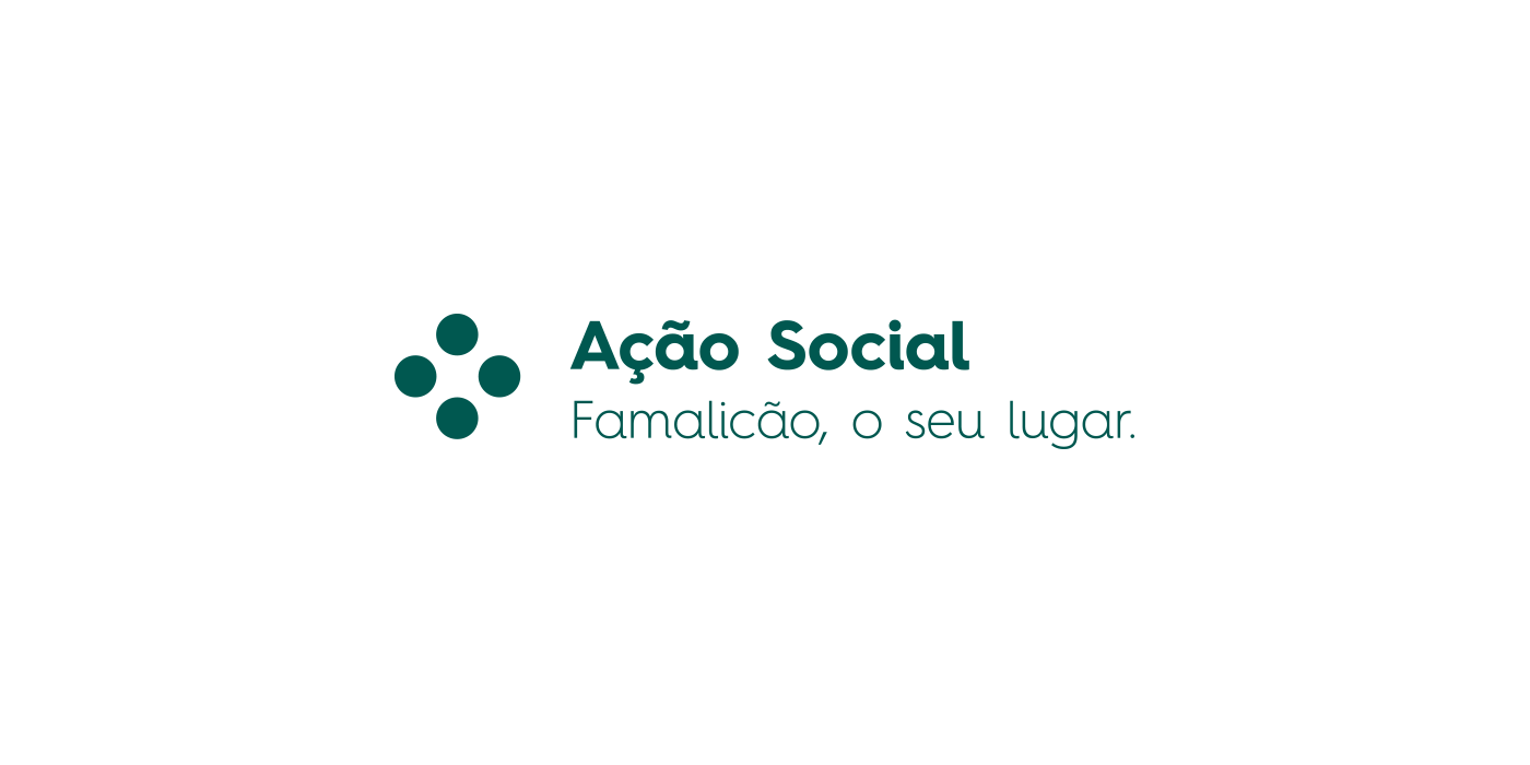
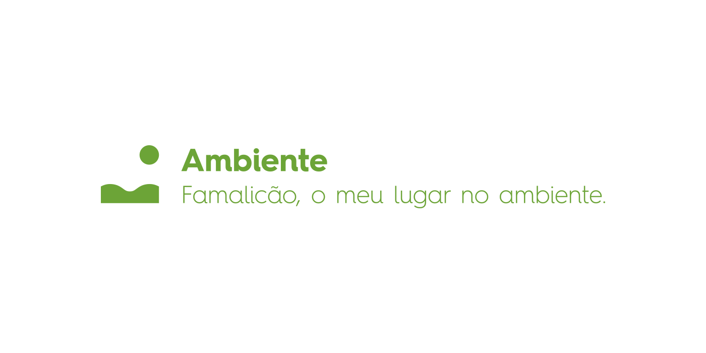
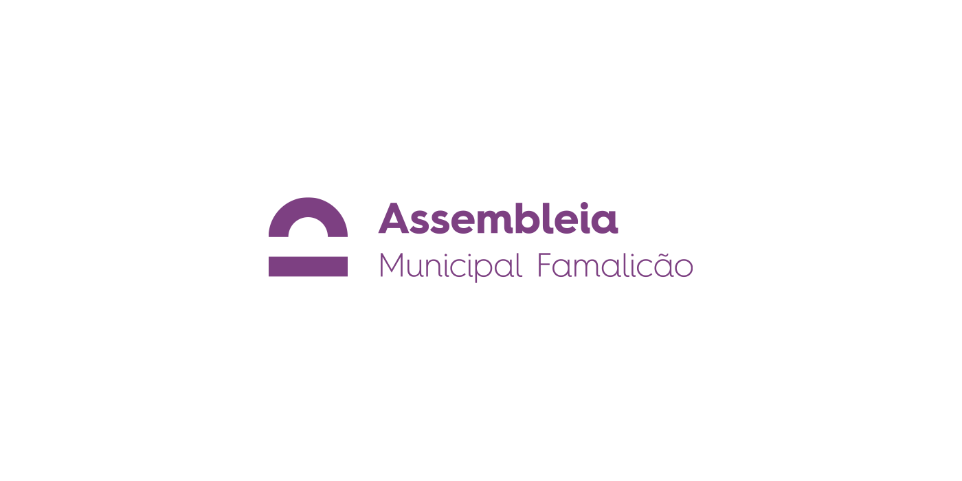
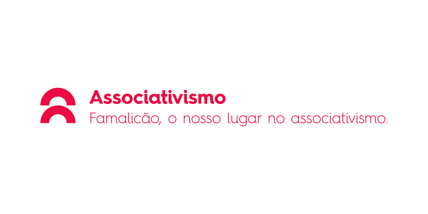
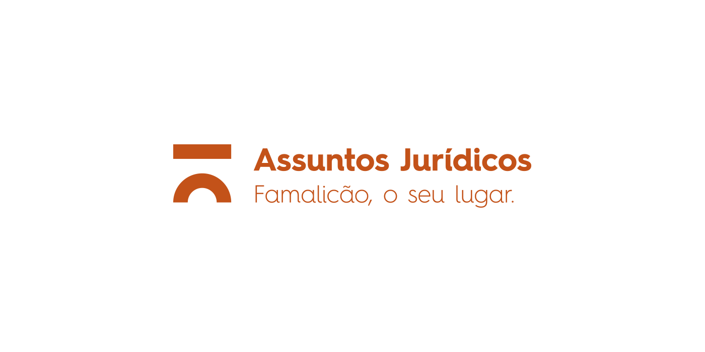
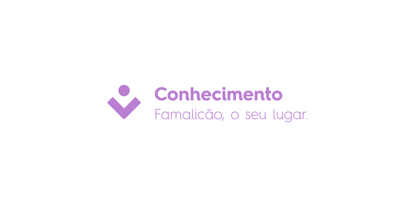
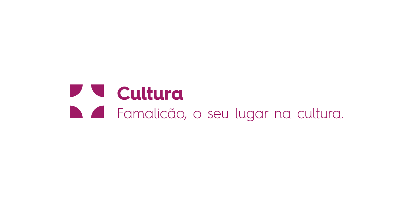
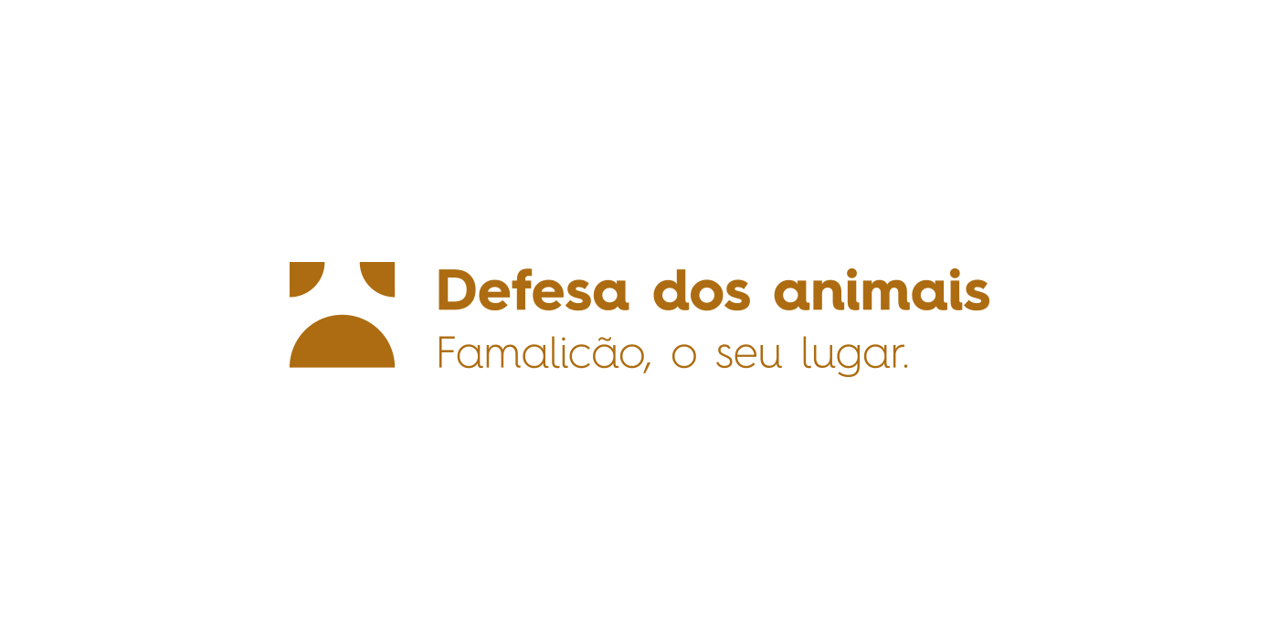
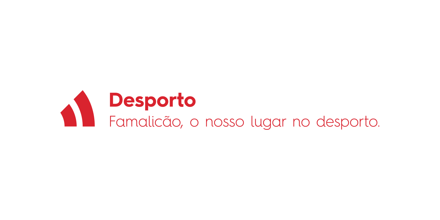
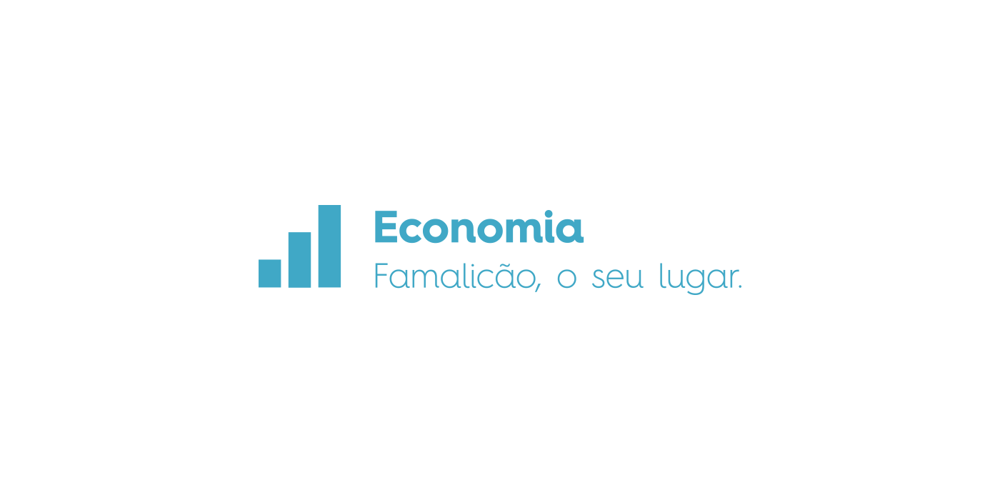
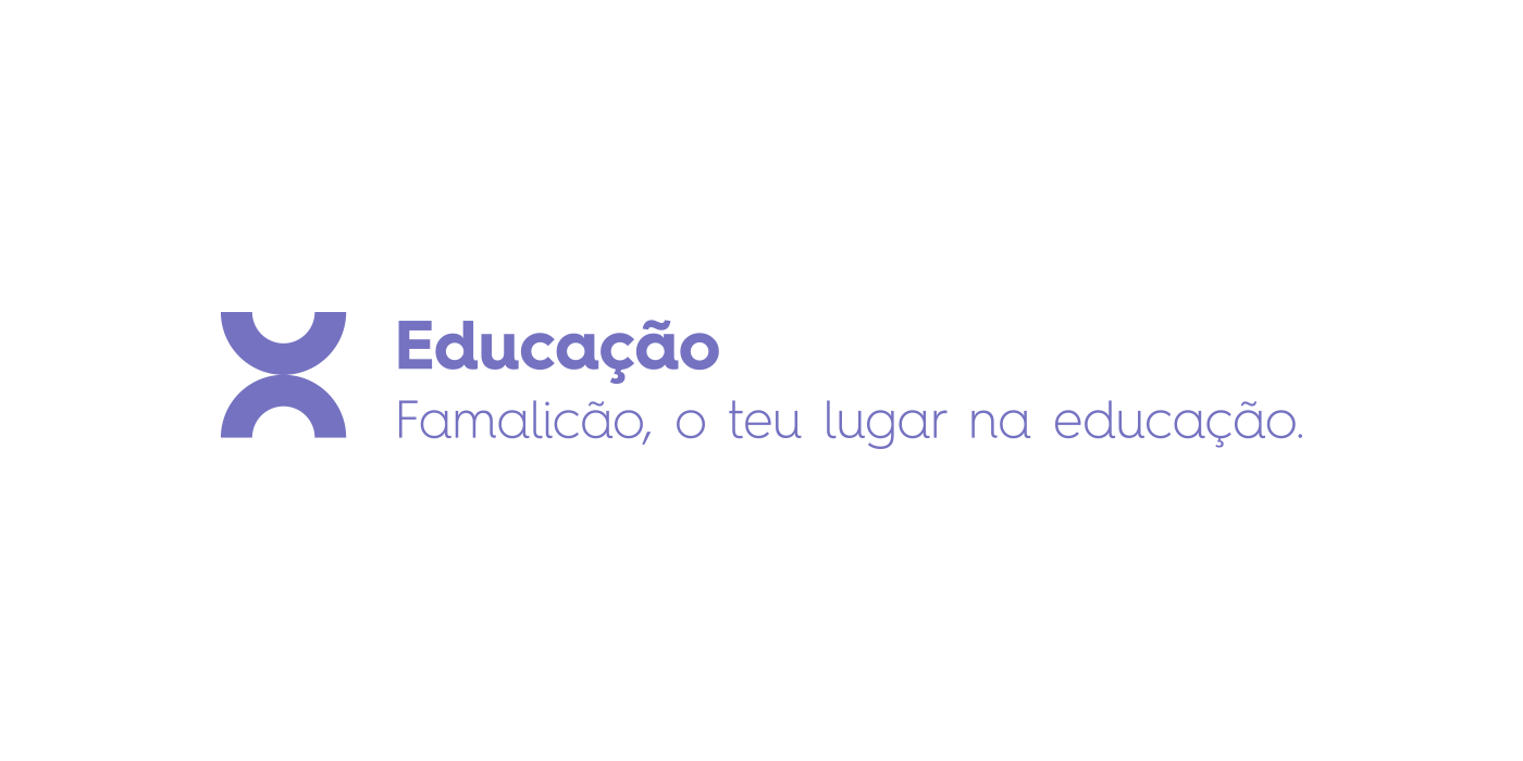
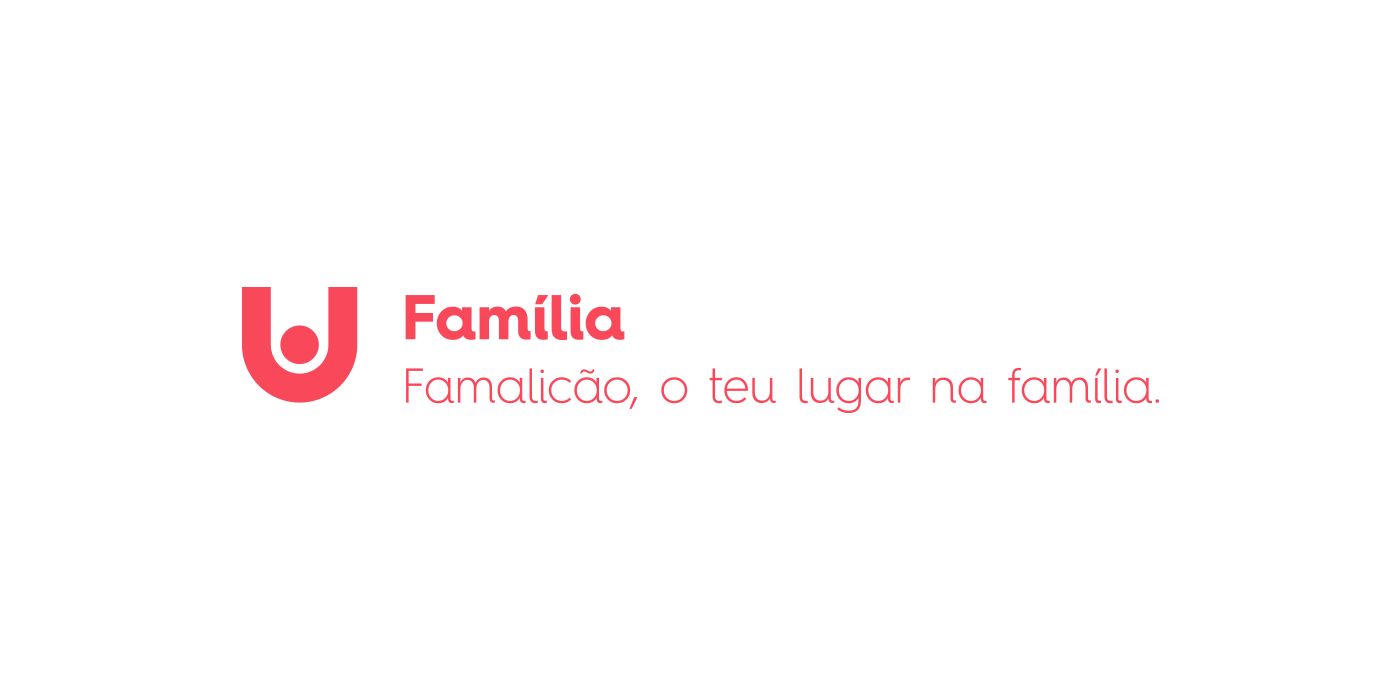
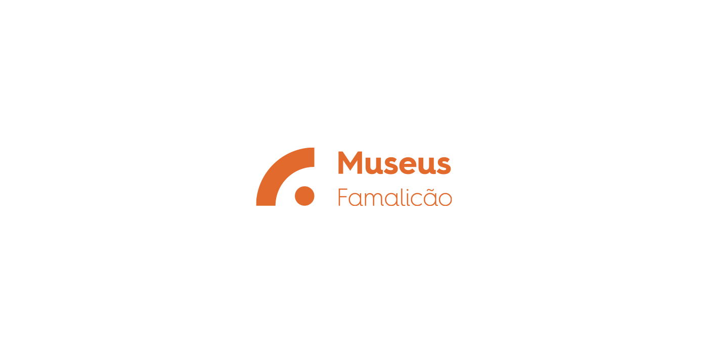
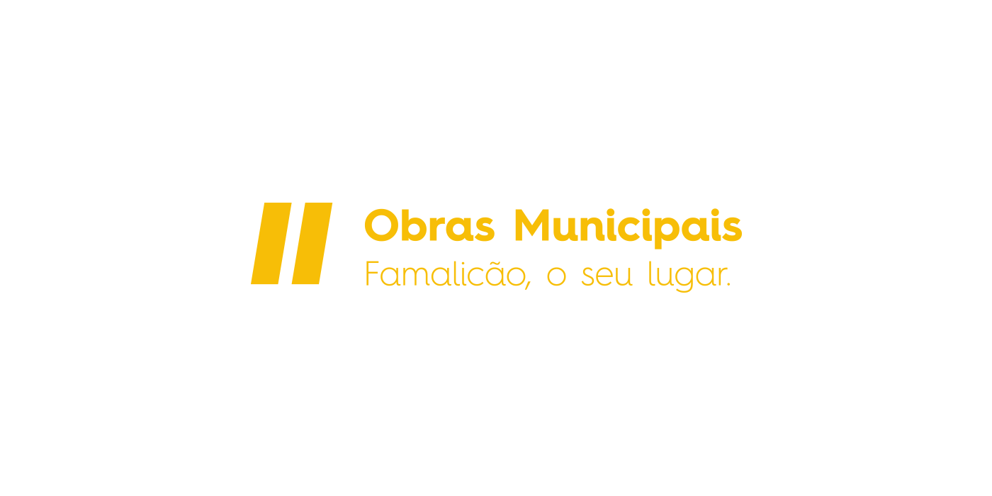
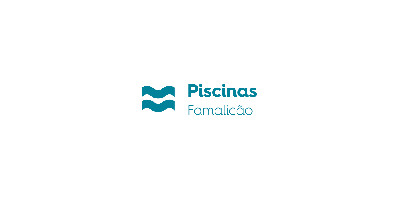
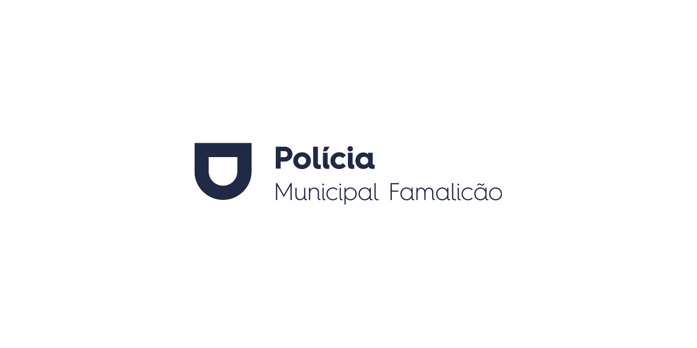
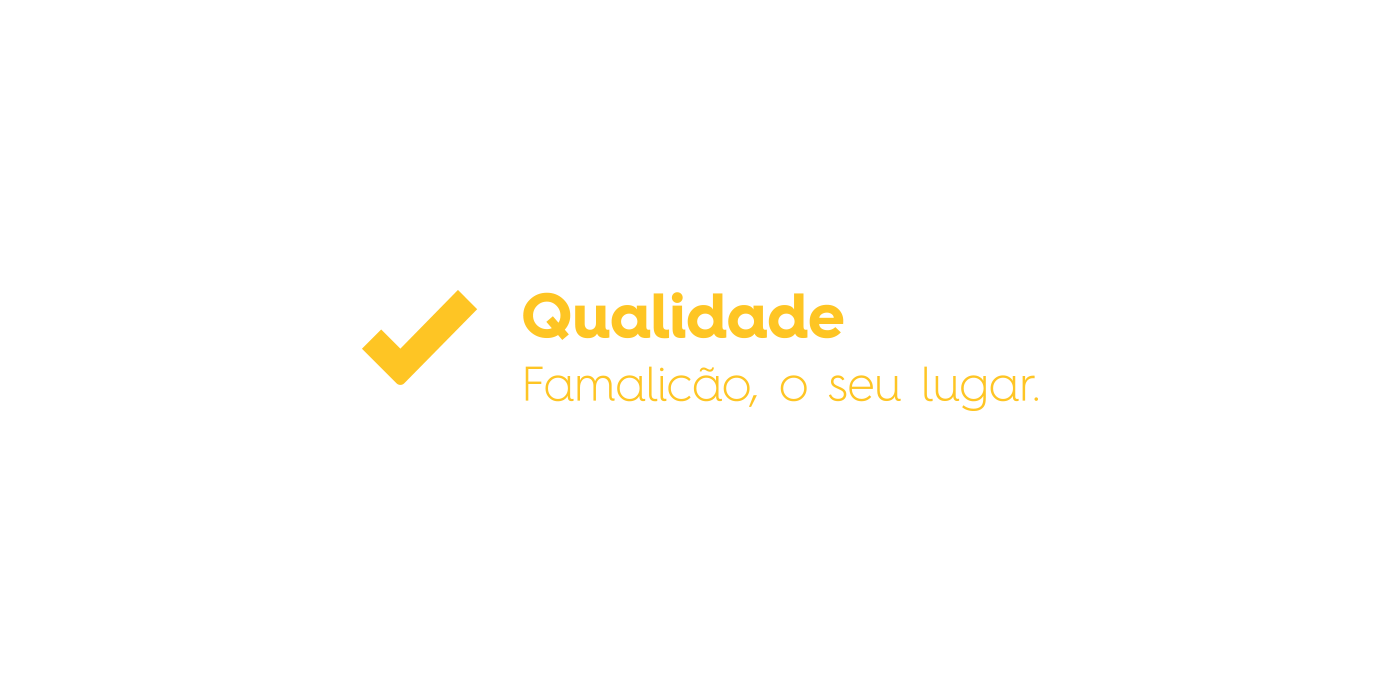
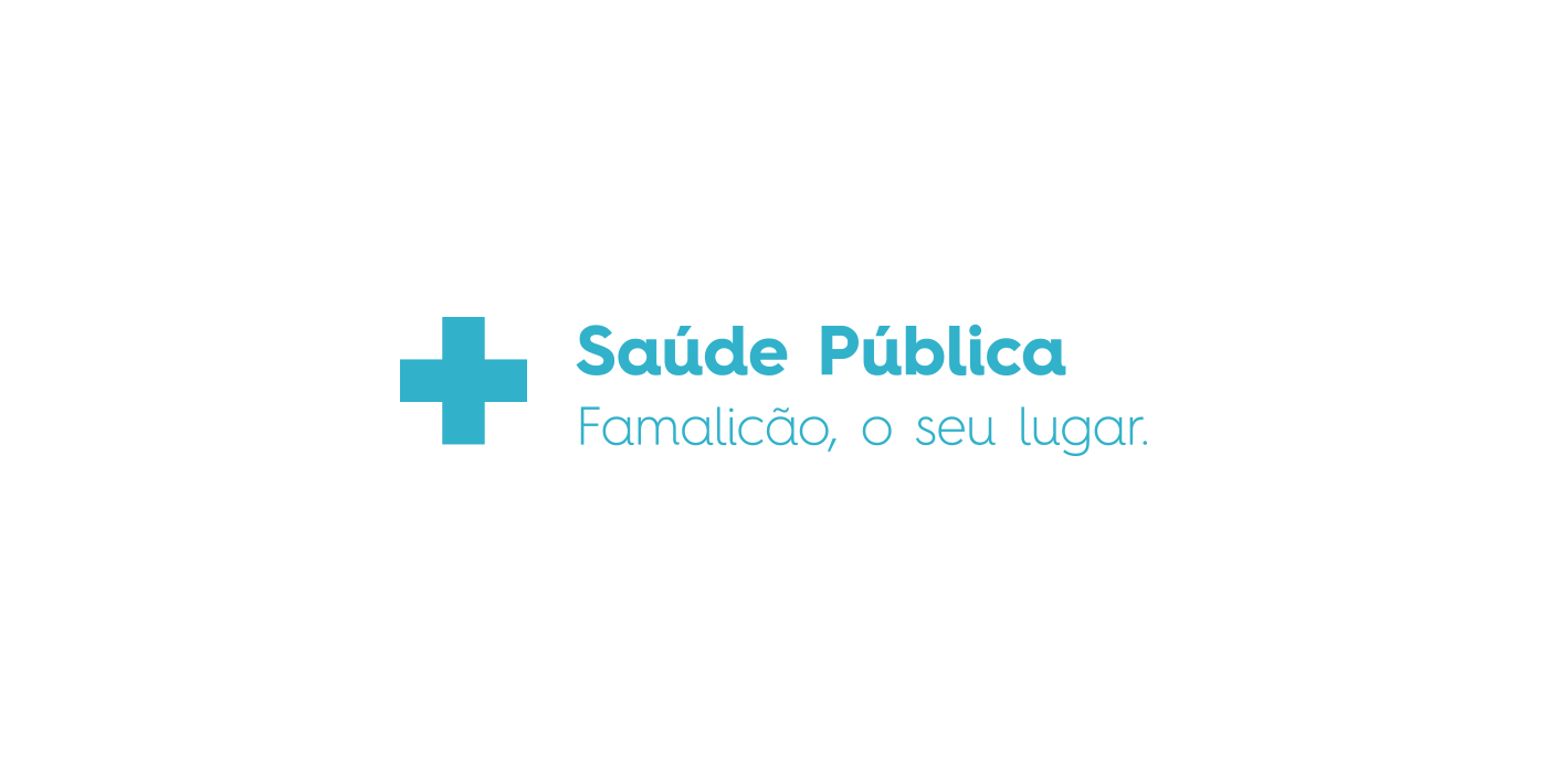
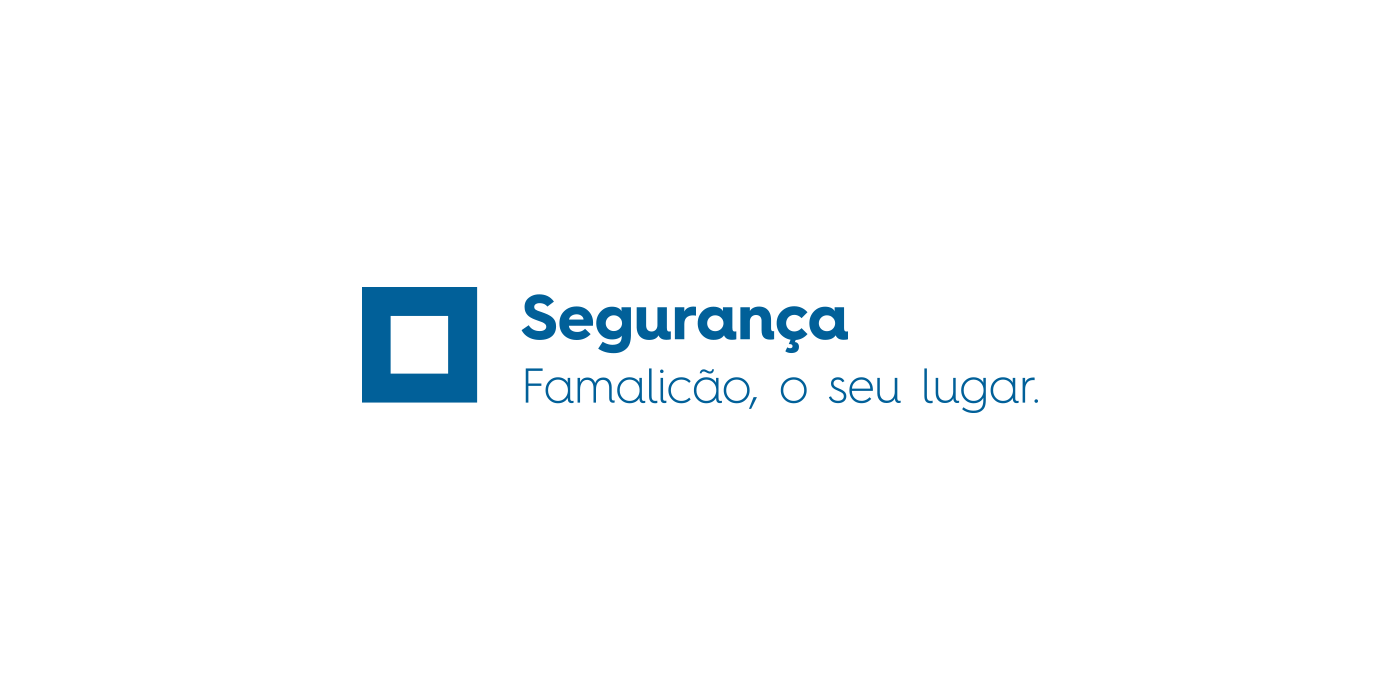
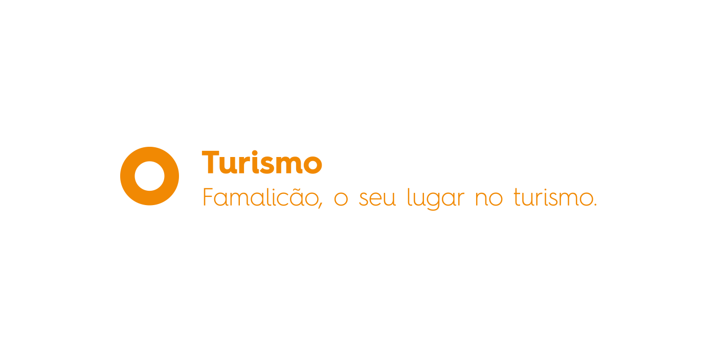
The visual universe of the brand is versatile and dynamic, presenting various shapes and colors that allow its use in multiple contexts.
Visual Universe - applications
With the ability to adapt to several audiences, Famalicão's new visual identity is reflected in the stationery in a more sober and timeless form, maintaining brand aesthetics harmony.


We added the color gold to the presidential stationery. This is a color that gives the communication materials a more distinct and formal look.


As Famalicão is a unique place, due to its historical and cultural heritage, business fabric, education, and environmental quality, it was necessary to create a visual identity that absorbed and reflected Famalicão at its fullness.
A visual identity with DNA, inclusive and quickly appropriated by all.
Famalicão - Your place.
Credits
Brand concept & brand strategy:
U Lah Lah Design Studio
Brand architecture & development:
U Lah Lah Design Studio
Art Direction and project management:
Ricardo Cunha Santos
Designers:
Cátia Lopes
Maria Grønlund
João Amorim
Main Symbol:
Maria Grønlund
Derivative Symbols:
Cátia Lopes
Typography, visual applications, creative elements, print and digital design:
Cátia Lopes
Identity manual Creation & Guidelines:
Cátia Lopes
João Amorim
Video & VFX:
Gustavo Cunha
Herlander Martins
Voice Over:
Paulo Macedo
Motion & photography:
Herlander Martins
Copywriting:
Elsa Pereira
Olga Pereira
Consultancy:
Maria Grønlund
Olga Pereira
José Luis Folhadela
Cláudia Carvalho
André Rodrigues
Special thanks to:
Maria Grønlund
Olga Pereira
Sandy KilPatrick
Rui Lima
José Luis Folhadela
Cláudia Carvalho
Artur Santos
We realize ideas.
Contact us